
Choosing the Right Colors for Your Home According to Vastu
Contents
When you step into your home, the colours on the walls, floors, and even furniture shape the mood of your space. While personal preference plays a big role, Vastu Shastra, a traditional Indian architectural science suggests that colours can also balance energies in your home and support vastu for home interiors. The idea is that different colours, when used thoughtfully, can enhance positivity, comfort, and even bring good fortune. Here’s how choosing the right colours according to vastu for each part of your home can help create an inviting, harmonious space.
Colours According to Vastu for Your Home
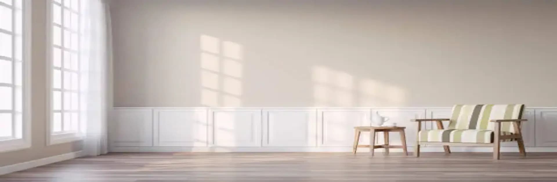
1. Living Room
The living room is often the social hub of a home, and Vastu suggests opting for calming colours that encourage harmony. Shades of light yellow, beige, or cream work wonderfully here as they promote a warm, welcoming vibe and align well with recommended vastu wall colours. Green is also considered ideal, symbolising growth and balance, which are key when creating an atmosphere for friends and family.
2. Bedroom
As per vastu colour for home, bedrooms need to have soothing colours that inspire peace and relaxation. Light blues and greens are highly recommended as they help lower stress and bring tranquility. Pastel shades or even off-white are great choices for creating a restful environment and are commonly preferred vastu colours for house interiors. Avoid overly bright colours like red or dark shades in this room, as they might disrupt sleep and restfulness.
3. Kitchen
The kitchen, being associated with fire (as per Vastu), benefits from colours that complement this element. Shades like orange and red can add energy, but these should be used sparingly. Soft yellows and light shades of pink or green work well to create an upbeat yet balanced cooking space and are suitable vastu colours for kitchen walls. Avoid using dark blue or black, as they clash with the fire element’s energy.
4. Bathroom
Bathrooms, according to Vastu, should have colours that signify purity and cleanliness. Soft shades of blue and white are ideal as they create a fresh and serene environment. Light pastels are also a good fit, but steer clear of dark shades like black or deep grey, as they can create a heavy feeling.
5. Home Office or Study
A home office or study requires colours that boost focus and productivity. Vastu suggests colours like light green, which represents growth, and blue, which fosters mental clarity, making them ideal vastu colours for study room spaces. You can also try a splash of light yellow for a dash of inspiration. Avoid using dark colours in your workspace as they may bring down the room’s energy, leading to sluggishness.
6. Children’s Room
Colours in a child’s room should be cheerful yet calming. Light yellow, lavender, or pastel pink can create a comforting environment that’s neither too stimulating nor too dull. Avoid dark or overly vibrant colours, as these can make the space feel overly energising or chaotic.
The Final Word
Choosing colours for your home according to Vastu isn’t about following strict rules but finding harmony and comfort. These guidelines can help you decide on colours that don’t just look good but also create positive energy in each room. By blending your personal style with Vastu’s recommendations, you can enjoy a home that feels both beautiful and balanced.