
POP Colour Designs: Modern Colour Combinations for Living Room, Bedroom & More
Contents
- POP Colour Combination for Living Room
- POP Colour Combination for Hallways and Passages
- POP Colour Combination for Bedroom
- POP Colour Combination for Kitchen
- POP Colour Combination for Dining Room: Ritual and Reflection
- POP Colour Combination for Child’s Room: Let It Be Light
- Choosing the Right POP Design for Your Space
- The Final Word
Plaster of Paris ceilings and walls can quietly shape the mood of a home. When you get the POP design and colour right, every room feels intentional, calm, and inviting. The trick is to choose a pop colour combination that respects the size of the space, the amount of daylight, and the tones of your furniture. In this guide, you’ll find practical ideas for the living room, bedroom, kitchen, dining room, children’s room, and even corridors, plus advice on picking the best colour for POP design for each area. Keep it cohesive, keep it simple, and let the details sing.
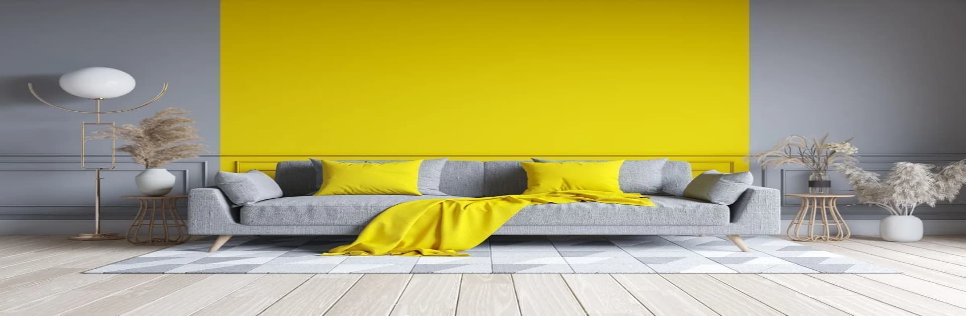
POP Colour Combination for Living Room
- Warm Neutrals with Bold Accents: Cream or soft grey ceilings create a relaxed canvas. Add a slim POP cove in mustard, teal, or forest green to draw the eye and frame the seating zone. This pop colour combination keeps things modern while staying versatile with seasonal décor.
- Classic White with Timber Tones: If you love a clean look, crisp white POP paired with warm wood furniture is timeless. The ceiling feels taller, light travels further, and the room looks considered rather than plain.
- Beige with Olive or Ink Blue: For subtle luxury, pair beige POP borders with olive or deep blue niches. It’s elegant without shouting, and it flatters metal accents, linens, and art. A strong contender for the best colour for POP design in social spaces.
POP Colour Combination for Hallways and Passages
- Light Pastels for Brightness: Narrow corridors benefit from airy shades. Sky blue, pastel yellow, or pearl white reflect light so the route feels open. A tidy choice for any hall POP colour combination.
- Contrasting Borders: Use a thin navy or charcoal line to define arches, downlights, and turns. This tiny detail adds structure without making the passage feel cramped.
- Soft White with Warm Lamps: A matte white POP finish paired with warm LEDs gives an even glow and reduces harsh shadows. It’s practical, clean, and the most forgiving pop colour combination for hall spaces with lots of doors.
POP Colour Combination for Bedroom
- Lavender and Cream: Gentle lavender on the tray or recessed section of the ceiling with cream around the edges creates a restful pocket. Calming and easy to live with.
- Pastel Green with White: Think morning freshness. A pale green POP cove with white fields balances cool and warm elements in bedding and curtains.
- Dusty Pink with Dove Grey: For a soft, grown-up scheme, keep pink muted and frame it with a thin grey border. This POP design and colour pairing looks serene under warm bedside lighting.
Also read:
https://www.godrejproperties.com/blog/best-bedroom-wall-color-combinations
POP Colour Combination for Kitchen
- Ivory with Lemon Yellow: A cheerful combination that still feels clean. Use ivory on the main plane and a lemon POP band above cabinets for a lift.
- Mint Green with White: Fresh and hygienic, mint with bright white suits modern cabinetry and stainless steel.
- Aqua with Soft Beige: Aqua accents on POP ledges help zone prep areas while beige keeps the room grounded. Easy to maintain and bright for early mornings.
POP Colour Combination for Dining Room: Ritual and Reflection
- Beige with Maroon: A beige backdrop across the ceiling, paired with a slim maroon rib around the pendant base, frames the table beautifully. It sets a warm tone for meals and conversation.
- Taupe with Olive Green: This refined pop colour combination pairs perfectly with wooden tables and brassware. It brings depth without making the room heavy.
- Rust with Off-White: A soft rust ring within an off-white field feels cosy in the evening and respectful in daylight. A tasteful nod to tradition.
POP Colour Combination for Child’s Room: Let It Be Light
- Baby Pink with White: Keep the base white and add baby pink in a small POP recess or star detail. Soft, playful, and easy to update later.
- Sky Blue with Lemon Yellow: Energetic yet light. Use sky blue on the larger area and a lemon band to outline shelves or study nooks.
- Light Green with Cream: Calming for bedtime, bright for study. This POP design and colour pair works well with simple timber furniture and colourful toys.
Choosing the Right POP Design for Your Space
Start with the function of the room and the amount of natural light it receives. Social zones handle contrast and richer hues; restful rooms prefer soft, layered tones. If you are unsure, create a thread of consistency from the entrance to the living room using one neutral base and repeat it in small doses elsewhere. For corridors and foyers, a bright hall POP colour combination, whites and gentle pastels, keeps traffic areas tidy and open. Always sample your chosen pop colour combination on the actual surface; light changes everything. Finally, let flooring, curtains, and metal finishes guide your accent choices so the whole home flows seamlessly.
The Final Word
Great interiors feel easy, not loud. A thoughtful POP design and colour plan can bind the home together, from the first step in the passage to the quietest corner of the bedroom. Whether you choose airy whites for a pop colour combination for the hall, muted olives for the living room, or buttery creams for the kitchen, aim for harmony. The best colour for POP design is one that you can enjoy every day: calm, balanced, and unmistakably yours.
Also read: https://www.godrejproperties.com/blog/exterior-home-color-combinations