
Best Kitchen Colours As Per Vastu: Direction, Placements, Tips And Benefits In 2025
Families seek calm energy in their cooking space, and a Vastu-aligned plan with the best colour for the kitchen supports steady comfort, warmth, and harmony. A gentle palate shaped by direction brings clarity, health, and a pleasant rhythm across each meal and gathering.
Contents
A kitchen carries care, memory, and a steady sense of belonging. It brings faces together with aroma, warmth, and heartfelt routine. A soft colour plan shaped by Vastu often lifts this spirit. Calm tones help each corner feel bright, grounded, and filled with gentle strength.
Colour Choices That Strengthen Daily Comfort
Vastu connects this space with the fire element, linked with vitality and nourishment. Warm, earthy shades create steady energy in busy settings. Families seeking harmony start by asking which colour is best for the kitchen according to Vastu, since direction shapes every choice.
Southeast spaces shine with orange, peach, light red, or pale yellow. East or north settings favour green or skytones. West settings glow with cream or beige. These shades strengthen balance, clarity, and smooth flow across daily tasks.
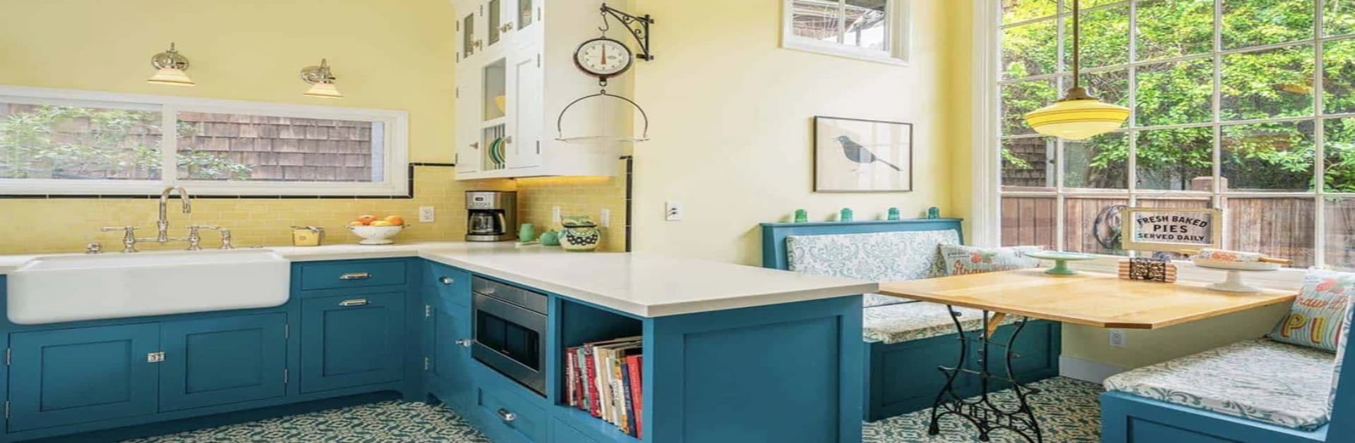
Shades For Walls, Platforms, Tiles And Trolleys
Calm Vastu colours for kitchen walls shape the feeling of the space. Pale green, cream, peach, or soft yellow carry brightness without strain. These colours support healthy, easy, and peaceful cooking.
Families also check which colour is best for the kitchen slab, according to Vastu, to build a strong base. Green, brown, beige, or soft orange slabs carry grounding energy. These colours help the flame element settle with grace and strength.
A gentle kitchen tile colour, as per Vastu, adds freshness. Light beige, cream, pale green, or sky blue bring clarity and warmth. Heavy shades create heaviness, while soft tones keep the kitchen lively.
Storage also shapes harmony. A simple kitchen trolley colour as per Vastu works well when families pick mild browns, wood finishes, or steely tones that blend with the larger palette. These shades keep the area calm, clean, and pleasant.
Direction-Based Colour Guidance
Direction shapes the final palette. A strong southeast kitchen colour, as per the Vastu plan, highlights orange, peach, yellow, or fire-strengthening tones. East settings enjoy green. West settings glow with cream or light grey. North kitchens remain balanced with sky shades.
Simple Vastu Guidance For A Balanced Kitchen
Families pick colours that feel emotionally warm and easy on the eyes. They keep corners clear, allow sunlight, and favour natural ventilation. Calm shades brighten conversations and encourage smooth cooking flow. Regular cleaning helps energy move freely through the space each day.
The Final Word
A Vastu-aligned palette blends energy, comfort, and family harmony. Gentle tones strengthen daily rhythm and shape a nurturing kitchen. When families select a thoughtful kitchen colour according to vastu, each moment in this warm space carries clarity, care, and a sense of grounded joy.